White and gray, the simplest color
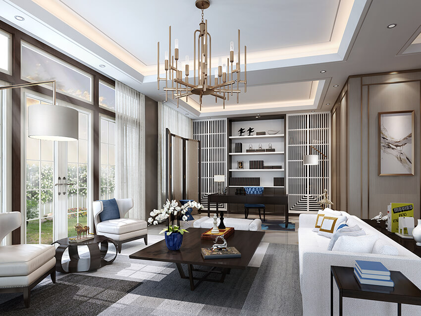
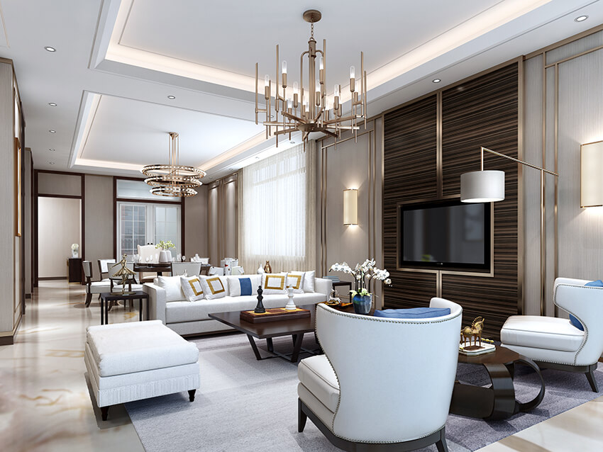
Living room rendering, want simple namely. White and gray, the simplest color. So we use white and grey in our living room rendering most of the time. Because the living room is to be simple and comfortable.
 A good living room rendering needs enough light
Through the interwoven composition of lines and volumes, draw the outline of the three-dimensional level of the space, abandon miscellaneous decoration, extremely restrained introverted character.The living room has abundant daylighting, sunshine is sneaking into the living room through french window, the soft sun shone on the sofa, there is a kind of light and pure dialogue with shadow as if in the space. Screens in the vertical and vertical intensifies the real and virtual rhythm. The drooping droplight builds a quiet and comfortable environment in concise and comfortable.
 Simple, including warmth and comfort
With modern and simple language, the boundary of functional interval is blurred through the virtual and real processing of space, forming a free space, sharing and private role exchange, both extension and transition, and details overlay, foiling rich and diverse space emotion. The space is free between white and gray, use brown to serve as bouncing color, comfortable sofa, gray stripe carpet, fashionable pillow and classic droplight, build a rich and diverse space emotion.Colour and lustre alternates with modelling changeover, revealing the individual character of host and grade inadvertently. The combination of white and grey makes the space gentle. The open layout absorbs sunshine and air, making the rest safe, comfortable and quiet.
 A good living room rendering needs enough light
 Simple, including warmth and comfort